Friday, February 4, 2011

Concentric circles in the style of Kandinsky

You need:
  1. drawing sheet A3 size with 12 squares of 10 by 10 cm
  2. temperea paint
  3. brushes
  4. paper towels
  5. jar with water

Wassily Kandinsky (1866 – 1944) was a Russian-French painter. His style of painting originally belonged to expressionism, and is sometimes included in symbolism. Kandinsky was one of the artists who gave shape to the abstract art in the early twentieth century.

Kandinsky was inspired by music. According to his own timbre theory, each colour has its own language and expression, and each colour has a soul. Kandinsky tried to convert musical compositions into paintings. He heard colours in music and he saw music in colours. This correlation between music and colour is the starting point of this lesson.

Show students images of by Kandinsky. Tell that he listened to music while painting. Look at the painting 'Squares with concentric circles'. Which circle would belong to cheerful music? And what kind of music did Kandinsky hear while painting the dark circle?

Students are going to make a painting in the style of Kandinsky while listening to classical music. During this lesson they listened to Vivaldi's Four Seasons.
Each student gets a white sheet with 12 squares of 10 by 1o cm. Tell them to work from the outside to the middle. We may see no white anymore. Try to avoid two the same colours in one circle. Hang all paintings together on a bulletin board for a great group project!

Made by students of grade 1

Wednesday, February 2, 2011

In the style of Burton Morris

You need:

  1. several colours construction paper
  2. black cardboard 20 by 20 cm
  3. coloured cardboard 20 by 20 cm
  4. scissors
  5. glue
  6. black thick marker
During our USA trip in the summer of 2009, I visited in the Coca-Cola Company in Atlanta, There I saw the artwork of Burton Morris for the first time: five paintings of cola bottles in pop-art style surrounded by light blue bubbles. So beautiful! Now I found a way to do this in school. And I think I'm the first blogger with a Morris lesson!

Burton Morris (Pittsburgh, 1964) is an American pop-art artist. He is influenced by pop-art artists from the 60's and 70's, like Warhol, Lichtenstein and Haring. Now he is one of the most famous modern post pop-art artist. Morris's work shows a contemporary twist to traditional pop-art. His work is cheerful, energetic and colourful. His characteristic lines with the bright colours give his work a fantastic energy. Morris's work is known of tv-series like Friends and also appears in major advertising campaigns by U.S. companies like AT & T, Pepsi and Heinz.

Source: www.burtonmorris.com

Show artwork of Morris on the digital board. Discuss the features: bright colours, black outlines, little detail, movement by little lines, white lines that suggest light and the distinctive black star shape around or in much of his work.

Students are going to make an artwork in the style of Burton Morris with the subject: Valentine's Day.

Step 1. Take two colours cardboard: black for the edge and one colour for the background. take a construction paper for the big heart.

Step 2. Cut the edges of the background cardboard sloping away, to make a sort of rug. You have to cut at least 1 cm around.

Step 3. Cut a large heart from the second coloured cardboard. Cut white 'light lines' from a white sheet for on and around the big heart.

Step 4. Cut some smaller hearts from several colours of construction paper. Cut white 'light lines' and paste them on the little hearts; all on the same side.

Step 5. Paste the big heart on the coloured cardboard. Paste the light lines on the heart and around it.

Step 6. Cut long triangles from the sides of the rug, the 'flashy stripes'. Paste the rug on the black cardboard.

Step 7. Paste the small hearts around the big heart; you may k de kleine hartjes rondom het grote hart, where you can go over the triangles. Outline the small hearts with a black marker.


Step 8. Cut the black background away, leaving about 2 mm on the edges.

Step 9. Paste the work on a coloured sheet (A4 size) and cut it into a square.

Made by students of grade 4 and 5

Monday, January 31, 2011

Watch for Interview #6--Fred Crowley!


I'm delighted that Fred's agreed to be our next interview; I've loved his work on Flickr for ages. 

His people are so wonderfully real, so human; you feel as if you're sitting right there at the next table, having a coffee at Panera's. 

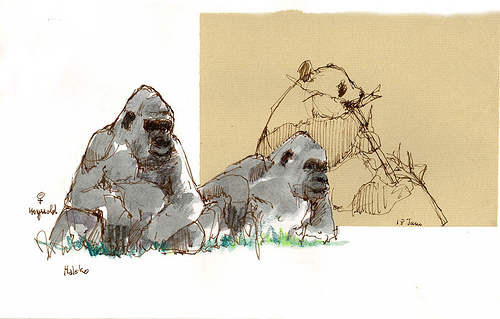
Fred uses strong graphic elements, like the red lamp and gold wall, above, and the panda on the patch, below--you will be inspired, I guarantee!


There's nothing Fred can't draw...his animals are superb, his life drawings so real they almost pop off the page.


His paintings may surprise you, too--they've got a Japanese feeling that's abstract at the same time--gorgeous!  We'll be sharing a couple of those too, with Fred's permission. 

Can't wait, eh?  I want to check a few details with him, then we're off!  (I can't wait either...)

Sunday, January 30, 2011

Wonderful lettering book...OOPS.


I LOVE this book, Modern Calligraphy and Hand Lettering: A Mark-Making Workbook for Crafters, Cardmakers, and Journal Artists, which someone here recommended!  Gorgeous and inspiring, and included some of my favorite calligraphers, as well as instruction on how to make some of your own lettering tools.  It's beautiful, and thank you!

It's also the SAME book as Modern Mark Making; from Classic Calligraphy to Hip Hand-lettering.  Different title, different binding, same book.  DRAT.

(Once you click the text link above you can use the "look inside" option--which I should have done, yes!)

So I put my brand-new copy up on Amazon at a reduced price; if you'd like it, check it out!  The link above should get you there.

Developing the Journaling Habit

That's one of the big topics in the poll in our sidebar (and feel free to vote, it'll stay up!), so I'd like to throw that open for discussion!  Correspondents, readers (friends, Romans, countrymen), lend us your...ideas!

Mine, of course, is that I carry a journal of some sort wherever I go...I even have tiny ones in the glove boxes of both our vehicles.  (There's always a pen, pencil, ballpoint, whatever, with me, of course, or I can FIND one.)

I'm READY.  It's handy.  So I take time to do it.

Spring at the Westlake Ace Hardware store...J. had gone in to shop for something, and I opted to wait by the flowering plants and sketch!


And then, I think of tiny bits of time as gifts.  If I'm waiting somewhere, if I have a few minutes, I take time to sketch in my journal, and perhaps make a few notes about what's going on.  It doesn't take long...

How about you?

Sketchbook Project Update III - Trees

Please click all images to enlarge.
It's time to celebrate trees :)

Walk with us to the 10th hole. It's
423 yards from the back tee to the green. The cart path runs along the edge of the woods.

Now that it's winter and much of the greenery has died back, I can see standing water not too far into the woods. This, along with the variety of trees found in a mere 423 yard stretch of land is a clear sign that this section of the neighborhood can be classified as a Bottomland Hardwood forest.

This type of forest usually borders a swamp and may be temporarily flooded should we get a whopper of a hurricane and the river reaches flood stage (not a warm and fuzzy thought!)

Here are all the trees I've identified so far. The illustrations are of two 'new-to-me' trees. I feel like such an explorer when I find a new flower, shrub, vine or tree. I don't care that Carl Linnaeus, or another botanist, may have named named it long ago - it's my discovery :) That's what I sooooo love about nature journaling! Even better is now that I've drawn it, it's mine.... forever in my heart :)

I never would have guessed Witchhazel comes from a tree! I always imagined witchhazel to be an herbaceous plant. A student of nature, that's what I am :)

These trees live on or near the 10th hole.


So many trees, not enough pages :) There are only two more spreads left in the sketchbook and I have other goodies to share. So, to all the trees that didn't make it into this book..... Patience, I'm working on it :)

Saturday, January 29, 2011

MORE evolving pages--gouache comes in handy!


Sometimes our sketches just don't get it for us.  I was at a family birthday party, where I normally sketch, and these little guys just didn't work.  They were too pale and wimpy, Aidan didn't look anything like Aidan, and these sure weren't the best Finn drawing I ever did.  The dog was actually the thing I was happiest with, on this page, and it was still just pale on that tan paper.

HOWEVER.  I normally make my own journals and I just haven't had time--this is the last one I have on hand, and I hated to waste a page!  I didn't want to erase them, either...so days later, I was sitting in the parking lot at the library, waiting while my husband ran in.  The snow cliffs, pushed off the parking lot by the snowplow, were impressive, so I tured to that page and sketched them in, in ink.


Later, back home, I added some gouache, and decided to just let the paint outline the earlier sketches.  It's a weird page, but I like it!  It captures something of the progression of our days, as well as of our journal pages. 

I used a white Gellyroll pen to add the text at lower right that balances the snow at the top...
Gouache (opaque watercolor) is a terrific journaling tool, particularly on toned paper.  Like white colored pencil, it really makes things pop.  That's what I used on this little journal, one of the rare ones I haven't made myself.  (It came from Moon Moth Press on Etsy, and I enjoyed using it, very much.  This one had the interesting green Bugra paper, and some lovely smooth 90 lb. Arches hot press watercolor paper, which was a pleasure to work on.  Check them out!)


Gouache worked rally well in the field, painting my favorite crumbling barn.

Several of our correspondents use gouache--you'll see a lot of it on Roz Stendahl's  pages, for instance.  You can find her blog entries, always a wealth of information, on the subject of gouache, HERE.

I made my own little traveling set by filling an old Winsor & Newton Cotman watercolor set with gouache from tubes.  Let it set up a few days, and I was ready to go!