Showing posts with label famous artists. Show all posts

Tuesday, November 22, 2011

In the style of Pablo Picasso


You need:
  1. white drawing sheet A4 size

  2. watercolour paint

  3. brushes

  4. black marker

  5. ruler and pencil

  6. scissors and gluetekenpapier op A4 formaat

  7. black construction paper 

Show some cubistic works of Picasso on the digital board. What do you see? What does the face look like?


Students draw a portrait. In this lesson we made a portrait of Zwarte Piet (Black Pete), the helper of our Dutch Sinterklaas. We called him Pietcasso! Of course this lesson can be done with any other portrait.

Colour the portrait with watercolour paint. Paint a background too. Outline with black marker.

Measure the face between hair and neck. Divide it in three and draw the lines with ruler and pencil on the drawing. Cut the three strips. Divide the strips in quares.

Paste the top of the face on a black sheet. Make a composition of the little squares; be sure there's not a facial square on the outside of the face. Paste the squares. Finally paste the lower face. 

.

Thursday, October 13, 2011

Burton Morris!!!

Made by a student of grade 6


In February I posted a lesson about Burton Morris. It is a tutorial to make artwork in his style.

Today I was highly surprised when I got an email of the artist himself! Burton Morris wrote me! You'll all understand how excited I was!!!


Dear Jacquelin,


I came across your blog and saw your student's artworks. I am truly touched that you honored my artwork in your teaching lessons and hope it was a success and inspired the children!


I hope to show again in the Netherlands one day and feel free to keep in touch.


Your friend,

Burton Morris


If you want to check it out again, follow this link: http://kidsartists.blogspot.com/2011/02/in-style-of-burton-morris.html


To see his wonderful website: www.burtonmorris.com

Tuesday, September 20, 2011

In the style of Henrique Matos

You need:
  1. white drawing sheet A4 size

  2. liquid water colour

  3. jar with water

  4. compasses

  5. ruler

  6. pencil

  7. black waterproof markers

Henrique José Teixeira Matos is a Portugese painter. He is born in 1961 in Oporto.  Matos painted landscapes, portraits and abstract works, but is best known for his op-art work.

Show pictures of Matos's work on Wikimedia Commons. Look especially the op-art works and discuss what you see.


More op-art lessons on this blog can be seen following the link Op-art.


Paint a white sheet of paper with liquid watercolour and a lot of water a plain background.


Drip some liquid water colour on the surface while it is still wet. Use more water if the colours won't flow. Leave the sheet to dry.


Use compasses to draw some small circles (2 cm average) on the sheet. Draw wider circkels around them. Fill the sheet with those circles and half ones near the edges.


Draw lines from the middle of the circles to the edges. Be sure it's an even number of lines and  Kkeep the lines as much as possible equidistant from each other. Color the squares alternating with a black marker or pencil.


By a student of grade 5, coloured with pencil

Monday, September 5, 2011

In the style of David Hockney


I found this terrific lesson on the blog 'Use your coloured pencils' of Anne Farrell. I used this lesson to tell about artist David Hockney and his swimming pool paintings.


You need:
  1. white drawing sheet A4 size

  2. coloured paper for background 

  3. oil pastels

  4. liquid water colour, blue and green

  5. brush

  6. jar with water

The successful British artist David Hockney was born in 1937 in Bradford, England. He studied at the Royal Academy in London. His first works were anecdotal and ironic. In 1964 Hockney moved to California, where he developed a more realistic way of painting. The main themes at this time, are pools, landscapes and portraits.

From 1966 David Hockney increasingly used photographs for his paintings. He made ​​collages containing just photographs. After 1980, Hockney's work became a more expressionistic character. His work shows influences of Picasso Besides paintings, Hockney also makes drawings and etchings. 


Look at artwork of David Hockney, especially those with swimming pools. Discuss with the students how people look like under water - flowing hair, lighter skinWhat causes the shimmering

surfaces on the water and what do they look like?
The students draw one or more people in swimsuits and colour them with oil pastels. Use white oil pastel to draw a water pattern in the background, consisting of wavy horizontal, vertical and diagonal lines.

Paint the picture with blue and/or green diluted coloured ink. The swimmers and the white lines will not resist the ink.

Artworks made by students of grade 4

Thursday, August 11, 2011

In the style of Klaas Gubbels

Made by a student of grade 5


Klaas Gubbels (Netherlands, 1934) is a Dutch artist. He is best known for his still lifes of tables, chairs and coffee pots. He also makes sculptures, mostly with the same subjects.


Gubbels attended various art schools and teached art at the Art Academy in Rotterdam.

Gubbel's work became more abstract over the years. A characteristic of Klaas Gubbels is that he avoids all that is 'beautiful'. Beauty is unreal to him and keeps us away from the truth. The subject isn't interesting, but the humour, agression or dullness of this subject, that's what it's all about. The utensils, if they are freed from their jobs, end up with a mood or emotion.
Gubbels uses various techniques in his works: painting, drawing, graphic techniques, but also photographs, collages, assemblages and sculptures in glass and metal.
You need:
  1. canvas A4 size

  2. acrylic paint

  3. brushes

  4. jar with water

  5. pencil

Show artwork from Klaas Gubbels. Discuss the subjects of his paintings. What stands out? Much or little detail? Depth? Perspective? Use of colour?


Students work on canvas with acrylic paint. Tell them about the properties of this paint: it dries quickly and is paintable.


Students have to make a painting with one of the topics that Gubbels frequently paints: chair, table or coffee pot. Unlike the real Gubbels works, the children in this task, however, have to paint a background. White is out of the question!


Made by a student of grade 5

Saturday, June 18, 2011

In the style of Keith Haring, group work

Group work, made by students of grade 2 and 3


You need:

  1. drawing sheet A1 size 


  2. pieces of cardboard 10 by 15 cm


  3. pencil


  4. scissors


  5. glue


  6. colour markers


  7. permanent black marker 

We worked in groups of five students.

Each student draws a figure on a piece of cardboard in the style of Keith Haring: no details, movement, a figure like in a comic. Cut the figures and trace them several times with pencil on the big sheet. Working together is required!

Instructions:

- Draw not twice the same figure next to each other.
- Vary the position: upright, horizontally, diagonally. Turn the cardboard to get a mirror figure.
- Do not start in the middle, but work from the side and place the figures as close to each other.
- Outline all figures with a permanent black marker.
- Divide the intervening areas into smaller areas by straight lines drawn with black marker.

- Choose one colour per person and colour the areas with these five colours.  
- Put your signature on the work, just as Keith Haring did!

Thursday, June 2, 2011

In the style of Romero Britto

Dutch tulips in the style of Romero Britto, by Malou, grade 6


This was one of my most successful lessons so far; students enjoyed it and the results were amazing: In the style of Romero Britto.


You need:

  1. white drawing sheet A4 size

  2. permanent marker

  3. colour markers

  4. ruler

Romero Britto is a Brazilian artist. He was born in 1963 in grew up an extremely modest lifestyle amongst eight brothers and sisters in Recife Brazil. His drew and painted on any scrap of newspaper or cardboard he could find and filled them with colourful images of a beautiful world.  

In 1983 Britto travelled to Europe to study the old masters. After this trip, he traveled to the USA where Pop Art was flourishing. He opened a gallery in Miami. In 1989,Absolut Vodka selected Britto to design an artwork with their famous logo. From that moment the name Britto was known to a greater public. His artwork are now represented in galleries and museums across five continents.

Paris in the style of Britto, by Emmy grade 6


Look at artwork of Britto on his gallery. Discuss the salient features: bright colours, simple shapes, the work is divided into sections that are filled with patterns, thick black outlines. Discuss how you to see the difference between the drawn picture and the background. Ask about the stylistic characteristics and where to classify this artist (Pop Art, Cubism).


The students have to make a drawing with a topic of their choice. No details, but only the main lines. Divide the drawing surface with pencil and ruler in several sections. Trace all lines with a waterproof black marker and then colour them with markers in the way Britto did.


For the background we stamped circles with toilet rolls on a coloured sheet and pasted the artwork on it.

Flowers in the styleo of Britto, by Nadia grade 6

Friday, May 13, 2011

MOMA

Made by Debbie, grade 6
You need:

  1. drawing sheet A4 size

  2. colour pencils

  3. ruler

A lesson about drawing one point perspective.


Students draw a square in the middle of their sheet and draw four lines from the corners to the middle, see schedule. These are the floor and ceiling lines. Draw two lines from both short sides to the middle. Between these two lines the paintings has to be drawn. Draw lines from the bottom to the middle for tiles or parquet.

It's nice to draw artworks that students have made this schoolyear or to choose for artworks of famous painters.

Colour with colour pencils.


Monday, April 25, 2011

Fantastic felines in the style of Laurel Burch


You need:

  1. pink or purple constrution paper A3 size

  2. oilpastels

  3. tempera paint

  4. brushes

  5. gold and silver markers

  6. glitter

  7. glue


Laurel Burch (1945 –  2007) was an American artist, designer and businesswoman. As a 20-year-old single mother she found metal in junkyards to hammer into jewelry to support her two children, and went on to launch her business, now called Laurel Burch Artworks, in the late 1960s with the help of a small staff that worked out of her house. She began making paintings and was commissioned by restaurants, businesses and private collectors. Burch designed, among other things, beads, jewelry, paintings, T-shirts, scarves, coffee mugs and tote bags, but 90% of her designs derived from her original paintings.


Especially Burch's cats are recognizable. Few some of her paintings on the website of Laurel Burch and discuss the salient features: bright colours, bold pattersn, eyes and nose are drawn out of one line. use of silver and gold.

 
Students draw a cat on purple or pink paper in the style of Laurel Burch. Colour the cat using different materials like tempera, oilpastels, gold and silver markers. Outline the cat with silver or gold. Draw a frame around the artwork. Use glitter to accentuate lines.


All artworks are made by students of grade 5


Sunday, April 10, 2011

In the style of Jean Dubuffet


You need:

  1. drawing sheet A4 size

  2. pencil

  3. thick markers in red, blue and black

  4. fine markers in red, blue and black

Jean Dubuffet (France, 1901-1985) was a French painter and sculptor. He was very interested in drawings of children and mentally disabled. He called those drawings Art Brut (raw art):art produced by non-professionals working outside aesthetic norms, such as art by psychiatric patients, prisoners, and children. Dubuffet sought to create an art as free from intellectual concerns as Art Brut, and his work often appears primitive and child-like.
Many of Dubuffet's works are painted in oil paint, thickened by materials such as sand and straw, giving the work an unusually textured surface. During the early 1960s, Dubuffet produced a series of paintings in which he limited himself to the colours red, white, black, and blue. Those works resemble jigsaw puzzles, such as Nunc Stans (Guggenheim Museum, New York), in which tiny, obscure, closely spaced figures and faces dominate.

Towards the end of the 1960s he turned increasingly to sculpture, producing works in polystyrene which he then painted with vinyl colour paint.


Look at artwork of Dubuffet, especially Allées et venues. Discuss the salient features: colours (mostly red, blue, white, black), recognizable and unrecognizable shapes, curved lines, hatched areas and the whole sheet is full.


Doodling wavy lines
Students fill their sheet with wavy crossing lines, using a pencil. Then they search human or animal figures in those lines. Trace these figures with a black marker. Colour the patches of these figures in red, blue, hatched red and hatched blue. Leave some patches white. Outline the figures with a wide black marker. Trace de remaining lines between the figures with a fine black marker.

Made by a student of grade 6

Tuesday, March 15, 2011

Surrealistic collage in the style of Dalí

By Tristan, 10 years old

You need:

  1. white drawing sheet A3 size
  2. magazines
  3. scissors
  4. glue
  5. tempera paint
  6. brushes

About Dalí

Salvador Dalí (Figueres, 1904 – 1989) was a Spanish painter and versitile artist. in his younger years he was interested in painters like El Greco, Michelangelo and Diego Velázquez. He focused his attention at that time to Impressionism and Cubism.
Dalí studied in Madrid from 1921 to 1924. In 1929 he moved to Paris. He met Pablo Picasso and André Breton and joined with surrealism.
In 1940 he moved to the USA and lived there for 15 years. After this he went back to Spain.
Dali's work can be divided in four periods.

Early period (1917-1927) - In this period Dalí made paintings of the landscape around Figueres. These works already show his kinship with Impressionism and Cubism.

Transition period (1927-1928) - This period is characterized by experimentation. He uses different textures, made with paint resins, sand, stone, cork and gravel.

Surrealistic period (1929-1940) - The Surrealists were not sufficient to logic alone. They focused on dreams and the subconscious. Dalí explored his own fears and fantasies and painted them on canvas through symbolic images in a very realistic, almost photographic style. He called his paintings "hand painted dream photographs'.

Classical period (1941-1989) - Dali stopped in 1941 with the surrealist style. He became fascinated by religion and modern science and found his inspiration in the ancient and Renaissance art.

Back to work

Show some surrealistic works of Dali and discuss the salient features: his work looks like a photo, contains 'strange' elements - things lijkt op een foto, bevat 'vreemde' elementen - things that can not actually. The work will surprise or a shock sometimes. Explain the difference between realism (reality painted on canvas, like a photo) and surrealism - realism with strange elements.
Tell students that they have to make a surreal collage today. For this they cut pictures from magazines, arrange them on a sheet and paste them. They may, if no proper background is to be found, paint a part of this background.

When ready

Discuss the artworks: what surrealistic elements do you see? And what are the realistic elements? What do you think of the combination of both?

Sunday, March 13, 2011

Baby and blanket, in the style of Gustav Klimt

Made by Debbie, 11 years old

You need:

  1. white drawing sheet A4 size
  2. pencil
  3. colour markers
  4. chalk pastel

Gustav Klimt (Austria, 1862 – 1918) was born in the neighbourhood of Vienna. In 1876 Klimt was awarded a scholarship to the Vienna School of Arts and Crafts . His work consists of paintings of mostly women, but also wallpaintings, drawings and collages. Klimt is much praised for the use of gold in his paintings.

Show some artwork of Klimt, and especially the painting 'Baby'. Discuss the distinctive features in the work: different patterns in the blanket, many colours, the blanket is more important than the baby, wavy lines verschillende patronen in de deken, veel kleuren, de deken is belangrijker dan de baby, wavy lines to express the folds of the blanket.

Students draw a baby in its bed, covered by a patchwork blanket. The blanket has to be divided into sloping surfaces. All different patterns should be coloured with markers.
Drawing little black stripes at the edges of the fabrics, will make the patchwork blanket look more real. Use chalk pastel for the a wallpaper behind the bed.

Tuesday, March 1, 2011

In the style of Gaston Chaissac


You need:

  1. drawing paper A3 size
  2. tempera paint in primary colours
  3. brushes
  4. jar with water
  5. paper towels
  6. bold black marker
  7. black construction paper
  8. glue or stapler

The French painter and writer Gaston Chaissac was born in 1910. He came from a poor family and was often ill. In 1934 Chaissac moved to Paris and worked as a shoemaker.
He lived in the same house as the German artist Otto Freundlich. It was through the friendship with Freundlich that Chaissac developed the desire to become an artist. He trained himself as an autodidact, supported and promoted by Freundlich. Freundlich also introduced him to the Parisian art scene.

Chaissac exhibited his works in 1938. During his stays at a sanatorium because of his tuberculosis in 1938 and 1939, Gaston Chaissac used the time to paint and draw. After his wedding he moved to the Vendée.

The artist bridged this isolation in the countryside through lively correspondence with gallery owners, authors and artists in Paris. Although Chaissac endeavored to establish a connection with the artist community, he was only valued as an artist by a small circle of gallery owners, journalists, and friends.

As a result, he didn't receive the expected recognition during his lifetime. Chaissac worked as a tireless experimenter and used materials that he found for his works of art - newspapers, shells, peels etc. He painted on every substrate available to him, created pen and ink drawings, watercolours, oil paintings, collages and unusual three-dimensional works. The artist was sometimes classified by Jean Dubuffet with the 'Art brut'. Chaissac himself called his work rather rustic modern.

Gaston Chaissac died in 1964.

Without title, © Gaston Chaissac

View photos of the work of Chaissac and especially the work above. Discuss the salient features: bold black lines that separate colour planes, little depth, simply drawn faces, white planes. What would those white planes mean?

I chose this painter also to repeat colour mixing skills. The students draw on their sheet one head and one or more limbs. Put a pencil mark in these planes, because they have to stay white.
Then divide the sheet with wavy lines into small areas. Students choose two primary colours and use them to mix several colours. Paint the different planes with these mixed colours. Start with the brightest colour and and add more and more of the darker colour.

When the work is dry, outline every colour with a black marker. Bumps will disappear. Finally draw eyes, nose and mouth in the face. Paste or staple the work on black paper.

In the style of Gaston Chaissac, by students of grade 3

Saturday, February 5, 2011

Patterned hearts like Jim Dine

You need:

  1. drawing sheet A5 size
  2. crayons
  3. liquid water colour
  4. brush

Fold the sheet of paper into quarters. Cut a heart out of a piece in the hearts: Trace this heart four times with a pencil. Draw patterns in the hearts with crayons: stripes, circles, zigzag lines etc. Draw different patterns around the hearts.

Paint the whole sheet with liquid watercolour. The crayon will resist the ink.

Friday, February 4, 2011

Concentric circles in the style of Kandinsky

You need:
  1. drawing sheet A3 size with 12 squares of 10 by 10 cm
  2. temperea paint
  3. brushes
  4. paper towels
  5. jar with water

Wassily Kandinsky (1866 – 1944) was a Russian-French painter. His style of painting originally belonged to expressionism, and is sometimes included in symbolism. Kandinsky was one of the artists who gave shape to the abstract art in the early twentieth century.

Kandinsky was inspired by music. According to his own timbre theory, each colour has its own language and expression, and each colour has a soul. Kandinsky tried to convert musical compositions into paintings. He heard colours in music and he saw music in colours. This correlation between music and colour is the starting point of this lesson.

Show students images of by Kandinsky. Tell that he listened to music while painting. Look at the painting 'Squares with concentric circles'. Which circle would belong to cheerful music? And what kind of music did Kandinsky hear while painting the dark circle?

Students are going to make a painting in the style of Kandinsky while listening to classical music. During this lesson they listened to Vivaldi's Four Seasons.
Each student gets a white sheet with 12 squares of 10 by 1o cm. Tell them to work from the outside to the middle. We may see no white anymore. Try to avoid two the same colours in one circle. Hang all paintings together on a bulletin board for a great group project!

Made by students of grade 1

Wednesday, February 2, 2011

In the style of Burton Morris

You need:

  1. several colours construction paper
  2. black cardboard 20 by 20 cm
  3. coloured cardboard 20 by 20 cm
  4. scissors
  5. glue
  6. black thick marker
During our USA trip in the summer of 2009, I visited in the Coca-Cola Company in Atlanta, There I saw the artwork of Burton Morris for the first time: five paintings of cola bottles in pop-art style surrounded by light blue bubbles. So beautiful! Now I found a way to do this in school. And I think I'm the first blogger with a Morris lesson!

Burton Morris (Pittsburgh, 1964) is an American pop-art artist. He is influenced by pop-art artists from the 60's and 70's, like Warhol, Lichtenstein and Haring. Now he is one of the most famous modern post pop-art artist. Morris's work shows a contemporary twist to traditional pop-art. His work is cheerful, energetic and colourful. His characteristic lines with the bright colours give his work a fantastic energy. Morris's work is known of tv-series like Friends and also appears in major advertising campaigns by U.S. companies like AT & T, Pepsi and Heinz.

Source: www.burtonmorris.com

Show artwork of Morris on the digital board. Discuss the features: bright colours, black outlines, little detail, movement by little lines, white lines that suggest light and the distinctive black star shape around or in much of his work.

Students are going to make an artwork in the style of Burton Morris with the subject: Valentine's Day.

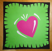
Step 1. Take two colours cardboard: black for the edge and one colour for the background. take a construction paper for the big heart.

Step 2. Cut the edges of the background cardboard sloping away, to make a sort of rug. You have to cut at least 1 cm around.

Step 3. Cut a large heart from the second coloured cardboard. Cut white 'light lines' from a white sheet for on and around the big heart.

Step 4. Cut some smaller hearts from several colours of construction paper. Cut white 'light lines' and paste them on the little hearts; all on the same side.

Step 5. Paste the big heart on the coloured cardboard. Paste the light lines on the heart and around it.

Step 6. Cut long triangles from the sides of the rug, the 'flashy stripes'. Paste the rug on the black cardboard.

Step 7. Paste the small hearts around the big heart; you may k de kleine hartjes rondom het grote hart, where you can go over the triangles. Outline the small hearts with a black marker.


Step 8. Cut the black background away, leaving about 2 mm on the edges.

Step 9. Paste the work on a coloured sheet (A4 size) and cut it into a square.

Made by students of grade 4 and 5

Tuesday, January 25, 2011

Abstract relief

You need:

  1. piece of grey cardboard 18 by 24 cm (cereal box)
  2. tissue paper
  3. wood glue
  4. several zijdevloeipapier
  5. houtlijm
  6. various free materials like rope, pasta, shells, sticks, buttons, etc.
  7. varnish
  8. coloured cardboard for frame

Look at the painting Catalan landscape of Joan Miró (Google pictures). Discuss what is on this painting, what things are definable and which are not. Explain the difference between realistic and abstract.

Tell the students they are going to make an abstract relief. Students make a composition of different items on their grey cardboard. They have to make a horizon line at least. Paste the different items with glue. Don't paste the items too close together and make sure it is not too full.

When the composition is ready, bring wood glue on all items and the cardboard. Cover everything with tissue paper. Push the paper firmly against the pasted items to make the tissue paper crumple. Here and there the paper will rip, so paste multiple layers of the same colour paper.

Finish with a layer of wood glue or wait until the artwork has dried and then apply a layer of varnish. Paste the artwork on a coloured background.

All artworks are made by students grade 3

Thanks to Ann de Naegel and her students.