Showing posts with label Roz Stendahl. Show all posts

Friday, April 13, 2012

Working with the Pentel Pocket Brush Pen

Pentel Pocket Brush Pen Sketch and watercolor . Click on the image to view an enlargement.
I've been doing a series of posts on intermittent Fridays in which I suggest projects which can be done in an afternoon or on the weekend.

Today I posted the first in a multi-part series on getting used to the Pentel Pocket Brush Pen. If you have one of these pens but haven't used it much, or have seen people using them and wondered if the pen might be for you, check out the post and the series (there will be at least 4 more on the Pentel Pocket Brush Pen in future weeks).

I'm also hoping to get some videos up so that you can see me drawing with the pen (but International Fake Journal Month is making my life a little full right now).

You might ask yourself, "Why would I ever use a brush pen? There doesn't seem to be any control, the lines are so dark…" and so on.

It isn't for everyone. But as with any tool practice will give you greater control. I'll also show ways you can work with its lines and paint in later segments.

I believe you owe it to yourself to at least give it a try because it might just be the increase in line vocabulary for which you're looking.

I'm not in anyway connected with Pentel or anyone who sells these pens. I just like to see the happy smiles on the faces of people when they pick one up and begin to sketch with it.


Why the Pentel Pocket Brush Pen? It's got individual synthetic hairs that make up a resilient and springy tip  that allows you to have sweeping as well as dry brush strokes. One friend admitted he'd never tried the PPBP because other brush pens he'd tried had no body in the brush tip. He walked out of my studio with one and has been using it ever since. While I can't give everyone in the world one of these pens (I wish I could, but I can't) I can let people know how fun it is to use.

(Note: I have also found the tip to be long-lasting. I use my PPBP daily, sometimes for several hours at a time and my pens last a long, long time.)

Also it has rich black ink which is waterproof (immediately on most papers depending on the paper's sizing) and that means you can paint over it right away with your watercolor or gouache washes.

I have always been a rather tight and detail oriented sketcher. OK, let's just say fussy. I typically use a dip pen or a fine point pen of some sort. The switch to the brush pen was massive for me because it meant darker bold lines. But I embraced the difference because it gave me access to quick sketching on a larger scale and because it helped me hone my editing capabilities. While I have more editing work to do in my sketching (and I'll enjoy every day of it) I have found that using the PPBP has actually improved my work with other pens as well.

And it's a great way to warm up and let your hand move across the page.

For all those reasons I think you should give the PPBP a try. For the next several weeks I'll be posting a new Project Friday with different exercises for using this pen.

I urge three things on people: Chocolate Chocolate (not a typo) Cake from Cafe Latte, journaling (both written and visual), and using a PPBP. All three are great fun. It can also be argued that all three are addictive.  But the last two can only have a positive effect! I hope you'll give the PPBP a try.

Don't Be Confused: Some people are confused by the various pens that Pentel makes. Here is a post I wrote about two of Pentels brush pens: The Pocket Brush and the Color Brush. You'll find out pros and cons for both there.

At the end of last year I started using Pentel's Aquash Brush Pigment Ink Filled Brush (I know, I know, but it is what it says on the package and you have to add the Pigment Ink Filled bit because they also call their waterbrush, which is empty, Aquash). I will have something more to say about this brush pen in my series on getting used to the PPBP, but in the meantime you can read my adventures of first using it by using my blog's search engine to look for "Aquash" posts.

Sunday, April 1, 2012

International Fake Journal Month 2012 Starts Today

Fantasy person from recent regular journal,
See details in post. Click on image
to view enlargement.
Today is the start of International Fake Journal Month 2012. On Roz Wound Up I've reminded people by posting some fantasy people I've been sketching. You can see more of them there.

You can also go directly to the Official International Fake Journal Month Blog and read about the event as well as see details about this year's contests (it's a prize drawing for participants as usual).

But I wanted to write for a moment about one of my fantasy people—who is NOT in my fake journal this year—because it points to one of the benefits of participating in IFJM.

Each year in April I keep a fake journal for 30 days. I've been keeping fake journals for ages but I formalized it in 2001 and started telling students about it, and finally in 2009 created a blog just for the purpose of promoting it.

I think it's a useful activity to use to learn more about one's real journaling process. This is best accomplished by setting goals and parameters for your character. Personally I like to set a limit to the art materials and subject matter that I will use. In my regular journal life I'm all over the place experimenting—testing and evaluating. IFJM is a luxurious contrast because for 30 days I sink into a medium and an approach and allow myself time to explore a little more deeply. I could do this any time in my life, and often in my painting I'll do this type of exploration with a month long, daily painting series like my bird series which became a show 30 birds in 30 days. But each year April's IFJM makes sure I take time for my art in a way I might otherwise over look.

The lead up to IFJM is now always a little bit overly busy for me because instead of just thinking about what I want to do for my project I'm posting about the event and encouraging other folks. This year I didn't do a lot of pre-posting because I'd already (in past years) written tips about how to prep, not prep, choose a book, and so on. I was also swamped with work deadlines and family obligations.

But I was really, really enjoying working in my recent regular 8 x 8 inch (approx.) journal which I'd made with TH Saunders Waterford 90 lb. Hot Press High White watercolor paper. And because I was enjoying it I wanted to push it and see what more I could do with it in the few remaining pages. (Often my desire to explore a new paper in my test journal is overwhelmed by the reality of having to take notes at meetings and otherwise document my life.)

In the last pages of the TH Saunders Waterford journal I got out a pencil I have on hand for doing an occasional sudoku puzzle first thing in the morning when I look at the weather. (I don't normally sketch with a pencil.) 

After scribbling down a face from memory, working small and blurry with the pencil, just letting my hand get a feel for the paper (this paper loves pencil), I started dabbing on and wiping off the paint to see how tough the paper was. (It's pretty tough.) It was fun. And the fun pushed me out of my rut of thinking about the paper I was going to use for IFJM and soon I was testing and rejecting the paper I thought I would use, and making all sorts of helpful decisions. I selected my next regular journal with paper that would be useful to continue this type of experimenting, and in the process I picked the paper for my fake journal. A plan came together.

Would I have come around to fiddling with this approach if I hadn't had IFJM "hanging" over my head? Probably, but also probably not for a month or more because of the other events going on at present and which regular journal I would have selected.

So whether or not you participate in IFJM I just want to urge you today to set up some deadlines and projects for yourself that will cause you to look at your journaling process and bust out (even for a short while) of habits and approaches that you've taken for granted.

You can always return to them, they won't go away, you won't "break" anything by taking an experimental plunge. But you'll come back to your regular journal practice with freshness and a new energy, and perhaps even some new approaches to how you visualize.

Friday, March 2, 2012

Use Color Fearlessly: A Color Theory Workshop

Above: Selection of paintings from Roz Stendahl, demonstrating her approach to color using a variety of media.
August 9 through 12, 2012 I'll be teaching a color theory workshop at the Midwest Art and Lettering Retreat. This four-day event is organized by the Colleagues of Calligraphy but is open to everyone. For details about the workshop please see my blog post Roz Wound Up: Use Color Fearlessly.

Besides being open to non-calligraphers this workshop is open also to artists of all skill levels. We will focus on blending colors from a limited palette of watercolors in order to understand the relationship of the colors. Students will develop a working understanding of color through experimentation and guided exercises which are chosen to provide useful color information regardless of drawing or painting expertise. This workshop will equip students with the skills needed to develop a personalized palette. I hope you will consider spending a bit of your summer in Minnesota exploring color with me.

Friday, February 24, 2012

Tearing Paper to Make Your Own Journals

Last year I got a criticism on one of my teacher evaluation forms. (Yes it does happen.) One student wrote, "I don't know why we wasted time on learning how to tear down paper and didn't spend all the time on sewing."

Now the evaluations are anonymous but I can tell you something about this student—she already had a way to tear down paper that she liked, or she owned a large paper cutter, or she was a member of the MCBA Co-op and had access to their equipment, or she is used to taking classes where the teachers prepare all the materials in kit form (and therefore doesn't make books at home on her own because she really hasn't learned hands on all the steps).

The class however was open to students of all levels. And my approach to bookbinding is to tear your own paper without expensive equipment—something anyone can do at any level.

Frankly I can't see how you can make a book without knowing how to tear paper, so it's an essential part of the process of bookbinding to me. As an instructor I believe it's important to go over the process of tearing, and in that discussion also bring up the various qualities of the paper, and of course demonstrate the proper technique. As a time management tool it also eliminates a bottleneck of students at the cutting machines and keeps class moving more quickly than it otherwise would. It is even more important to teach this skill when a book structure requires fussy tearing of a sheet to get a page size that can't happen simply by folding in half and in half. Showing how to measure in those circumstances is an important skill to teach.

So while I'm sorry the student was frustrated and I do try to pay attention to critiques, I won't be changing my approach—it is a foundation of my philosophy.

I know a number of the readers of this blog either already make their own books or would like to make their own books. Some of you may not know how to tear down paper. Today on my blog Roz Wound Up I have posted a video demonstration of me tearing a 22 x 30 inch sheet of Folio (which is a heavy weight printmaking paper). Along with the video I have provided a few additional written tips and recommendations including links to my posts on determining grain direction and also how to fold and collate your torn sheets so that you have matching surfaces across a page spread (some papers have markedly different fronts and backs). I'll be following up with another post discussing fussy tearing.

Monday, January 16, 2012

Thoughts on White Gouache

Above: Gull Study with different whites labeled. The acrylic white
gesso was added to the background before I decided to do a gull study
on this journal page. Click on the image to view an enlargement. 
I get asked a lot about my use of gouache both in my visual journals and in my stand alone paintings. Shortly after Kate started this blog I contributed a lengthy post about using gouache—the gum arabic based, opaque watercolor. Today I posted a discussion of my use of white gouaches on my regular blog (Roz Wound Up). Based on the response I've received to my initial gouache post here I thought it might be of interest here as well.

Gouache can be a tremendously fun medium in which to work. It allows for reworking and covering and is therefore "forgiving" in ways that transparent watercolor is not. It can be used in conjunction with transparent watercolor, and in fact, if you are using a quality brand your gouache paint can be used transparently in passages within a painting where opaque passages all exist. For me the great fun of using gouache is the feel of the paint as you put it on the support (I use gouache on paper, watercolor canvas, and Claybord™). I love moving and blending the paint—seeing the strokes or not seeing the strokes as my intention directs.

Gouache has other characteristics that are user friendly—most important for me it doesn't smell (again, if you get the right gouache!). Acrylic paints, which I use for some of my stand alone paintings can be wonderful for opaque techniques and even heavy body textural techniques to which gouache is not suited. But acrylic paints all have some sort of chemical smell which bothers me. And I have to get the stay-wet palette out to use them over the course of a day or a week. With gouache you can decide on the spur of the moment to paint, get called away, and come back at any time to continue.

I use both Schmincke and M. Graham brand gouache. Schmincke has little odor at all; M. Graham smells a bit like the honey that it is blended with. Both brands are pigment without added opacifiers so when you are mixing your colors your resultant colors are rich and not muddy. Both of these brands also rewet well which has allowed me to make my own pan travel palettes of them, for use in the field. (I spritz my pans when I start my sketch and the paint is a lovely consistency when it's time to paint moments later.)

If this brief statement of gouache intrigues you check out what I have to say about white gouache over on Roz Wound Up today. The more options you have in your visual journaling tool kit the more enjoyable your experience is going to be and the more likely it becomes that you'll build a life long habit. I hope you will, gouache use or not.

Note: I use gouache fairly thickly on my journal pages when I paint with it and despite that have rarely encountered a cracking problem. I mention this so that folks new to gouache aren't scared away by comments that "gouache cracks." It certainly will if you slather it on and then keep moving the support (in this case, keep bending the page you painted on), but you will quickly discover the thickness level as you work with it. If you want additional protection for your gouache pieces in your journal I recommend you use Microglaze from Skycraft (I'm not affiliated). It is a waxy substance you gently rub into the surface of your painting. It's acid free. It has a citrus smell. When it dries it has no waxy feel. It will, however, slightly alter your colors (as any finishing agent will) so you'll want to test it first on a sample. And it alters the matte finish of gouache every so slightly; again you'll want to test a sample.  I use Microglaze to give protection to my paper beads as well.

Saturday, April 30, 2011

Roz Stendahl's workshop!

Don't forget, Roz's free Strathmore journaling workshop starts May 1!  I think you need to go here first, to register:  http://www.strathmoreartist.com/vjworkshop2011.html

As noted, she has a workshop blog, HERE, and it's going to be a lot of fun.

See you there!.

Monday, April 25, 2011

My Free Online Journaling Workshop Is Almost Here!


If you haven't already heard, I've got a 4-part visual journaling workshop coming up over at Strathmore (using their new line of journals). It's free. I did this little video for fun last night to promote it.

If the embedded video doesn't play you can see the promo here. I hope you'll join me in May.

Sunday, March 27, 2011

International Fake Journal Month Is Almost Here!


If the embedded video doesn't work you can see a flip through of my 2009 Fake Journal here on YouTube.

It's almost April and that means International Fake Journal Month (IFJM) is about to begin.

IFJM is the celebration of fake journals. Every year in April I encourage people to keep fake journals for the month. (April is the obvious choice right?)

If you don't know what a Fake Journal is, let me explain: A fake journal is a journal that is kept by a character of your creation. It is kept day, by day, as any other journal would be. The entries are dated with the date that it actually is when when it was written, i.e., today's journal entry would be marked 3/27/2011. What is fake about the journal is the fact that the character is not you, and the character is not writing about your life.

You can read more about Fake journals, as well as Historical Fake Journals and Faux Journals at the Official International Fake Journal Blog.

Each year I set up a prize drawing for participants and you'll find information on how to enter the 2011 contests in the right hand column of that blog under "Contests for 2011."

I've kept fake journals off and on my entire life. It seemed a natural outgrowth of my daily journal practice and my slightly odd sense of humor.

And I have found the practice informative and helpful, in many of the same ways that I have found my real journal keeping to be.

Just some of the ways fake journaling can benefit you include: new strategies to shut up your internal critic; new proficiencies with media; discovery of creative ruts and ways to get around them; and of course play.

Creative play is always good. It helps us get back to our real work.

If the idea of a fake journal intrigues you I invite you to check out the links to the Official International Fake Journal Blog and read more about the process. You'll also be able to view a couple of my past fake journals, as well as the fake journals of past participants. You might concoct a way to take a vacation from your journal WITH your journal, or explore issues of interest in a new way.

If you are new to journaling (written or visual) I recommend that you not keep a fake journal until you have firmly established your own journaling practice. But in the meantime there is no reason you shouldn't enjoy the posts about fake journaling and be entertained by the work of other artists trying this out.

Most of my posts on fake journaling are really about journaling in general, or rather real journaling—I'm just trying to give you some options, some ways of seeing something from a different angle. Something that you can take back to your regular journal practice to make it deeper and more satisfying because it comes from a place of epiphany.—Roz

Friday, March 18, 2011

Interview #8--Roz Stendahl!

I'm pleased to be able to share this interview with my friend Roz, a talented and generous artist if ever there was one!  I asked her to share a bit about herself, before the actual interview, so here is: 

Introduction: A Little Bit about Roz

I'm a graphic designer, illustrator, and book artist living in Minneapolis, MN. I came up to Minnesota (the thought of snow didn't scare me off) to attend graduate school (I have an MA in English). After graduation I stayed, still not put off by the snow; and I was in love, with Dick who is an engineer (and he's stuck to Minnesota like a tick in a dog's groin).

I worked at a series of jobs in publishing, until I became a production editor for a company publishing college textbooks. Production editors handle the hiring and supervising of all aspects of a book's journey from manuscript to printed form-copyediting, proofreading, illustration, photography, typesetting, and printing. During my tenure there I discovered that my favorite part of the process was design, so I started doing designs for the books I handled, with my boss' blessing (it saved him money). Eventually I went to work for myself.

I like to have a lot of projects going on at the same time, besides work projects, so I started teaching journaling and book arts classes. I was fortunate to take classes with a truly skilled bookbinder, Denny Ruud. I learned several traditional bindings from him, but more important I learned to think about the book structure, the use of the structure, and the characteristics of the component parts. My own current structures are my experimental departures from traditional bindings. They meet my own sketching and painting needs. I have enjoyed encouraging students to look at their own journaling and sketching needs and requirements to create a book that is most useful to them. I try to teach a couple classes a year to encourage the bookbinding and journaling spark in others. My blog Roz Wound Up grew out of my teaching, replacing a Yahoo list I had for past students.

Also between branching out on my own professionally and 2003 we shared our lives with two Alaskan Malamute bitches-Emma and Dottie. Dogs give us great gifts every day. For an artist one of the greatest gifts is the reality of a live-in life model.

----------------------


And now, on to the interview!

------------------


Q Have you always journaled, and when-and why!--did you start?


A I have always journaled. My mother gave me my first journal/sketchbook when I was 3-1/2 years old and we were on the President Wilson traveling from the Philippines to the US. She wanted to keep me occupied. She told me to go and note things down and sketch. So that's what I did. Or as much as any 3-1/2 year old can. Scribbles which I thought were very important and of course meant something to me. I've had diaries and journal/sketchbooks ever since.


Q What's your favorite medium, can you tell me why?


A Pen and ink with watercolor or gouache washes. I like this medium because it's a great way to sketch-the pen and ink for line and even value shading, and then if you have time, the watercolor or gouache washes for adding color. You can take time to do really detailed pieces this way, or quick thumbnail sketches which you can make color notes on with the paint, to use as references for later paintings.

I like this medium because it is portable. A couple pens and I'm all set-though sometimes I do take my dip pen and a bottle of ink out and about for the ink. I like Staedtler Pigment Liners for my fine line-sketching pens as they are waterproof when dry and also the ink doesn't have a chemical odor like other waterproof pens I've used. I also really love the Pentel Pocket Brush Pen for its bold ink lines which can be thin, fat, dense or dry brush depending on how you wield it. So I can get along with a brush pen, a regular pen (or two of different widths) and then my small watercolor palette and gouache palette-both of which hold 11 colors and are children's palettes that are about 1 x 3/4 inch. I've simply popped out the kid's colors and put in my own from tubes. I use Daniel Smith and M. Graham watercolors in the watercolor palette and Schmincke Gouache and M. Graham Gouache in the gouache palette. I chose those brands because they have quality pigments and because they all re-wet really well. I carry a Niji waterbrush to use with the paints out in the field.


Readers can see my palettes (and read about them) at
http://rozwoundup.typepad.com/roz_wound_up/2008/10/travel-palettes-for-watercolor-and-gouache.html

I think the main reason I use pen, ink, and watercolor or gouache is that they don't smear on the opposite page of a spread.

I used to do a lot of colored pencil in my journals because I couldn't find journals bound with paper compatible with wet media. Colored pencils always smeared over time in my journals and also I was always having to take a large selection of pencils with me out into the field in order to have a range to work with.

Then I started making my own journals and I didn't have to worry about paper issues. I started watercoloring over pencil lines, but something about me prefers using pen and ink. I like the finality of the lines, or rather the boldness. I don't mind that I have to find my way to the line sometimes and have other lines in the image. It's all part of the experience, a record of my seeing of something.

Of course I had those extra lines when sketching with pencil or colored pencil too as I don't erase-but those lines were more muted and easier to cover or fade out.

I will still use graphite or colored pencil for sketching upon occasion and then cover with watercolor washes. The watercolor's gum arabic holds the graphite to the page nicely. But I always end up back with pen and ink. At least if I run out of time I always have the pen and ink and no smudging-if I had sketched in pencil without the watercolor it would smudge.

More and more I care less about smudging-but instead of going back to graphite and colored pencil I find that my growing tolerance for smudged artwork has led me to the brush pen's bold lines covered with Stabilo Tones (which will smudge). (Stabilo Tones are a water-soluble wax pencil that used to be made in a 60 pencil range and now is available in about 12 colors now called Woodys. It's a delight to use and I'm enjoying every last speck of my large set. People interested in working in a similar medium with a large color choice can try out the Caran d'Ache Neocolor II line. They aren't the same in all characteristics so the fun level is a little less, but it's as close as we can get since Stabilo doesn't want to make the full range of Stabilo Tones any more.


If you go to my blog and search under Colored Pencils and Stabilo Tones you'll find lots of articles on how to apply and work with this medium, and it's pretty much transferable to the Caran d'Ache, except the blendability is a bit different (less fun), but you'll get the hang of it.

So that's where I am right now. In 10 years I may be back to graphite and watercolor. Meanwhile in the studio I seem to be veering off further into fluid acrylics. I don't try to control it, I simply follow my nose. I do believe you have to stay with a medium long enough to really explore it, to understand how it works and what applications and situations it works best for. Other than that I'm always experimenting. Odor limits my choices, I have to stay away from any art materials that have either a chemical or strong floral odor. But I still have plenty of choices.


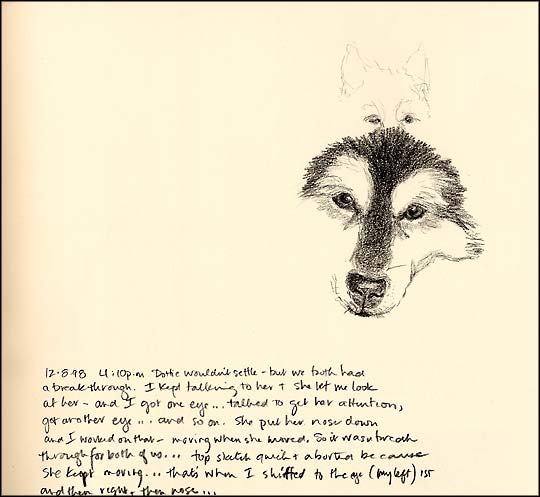
Q What made you start the Daily Dots? How do you feel about them now? [Roz's journal pages about her beloved dog.]

A I almost always have a DAILY project going on for a YEAR at a time. I was working on "The Correspondence Lab" which was a year of writing a letter every day. (I printed special stationery and envelopes with a logo, it was great fun; and I never worried about writing a long letter-just wrote something every day for a year. I did it because I felt that email was killing my correspondence habit!)

Well as "The Correspondence Lab" was winding down I got to thinking what I would do next for a DAILY-year-long project, and of course I looked down at my feet and there was Dottie. I'd been an illustrator since before I got my first dog Emma, and I didn't draw her much, or Dottie at first, just every so often. I regretted not drawing Emma more when she was alive. She died in 1996 and the letter writing project started in 1997 and ended in 1998. My train of thought was "Don't regret not drawing Dottie." So, like most things, two thoughts crash into each other at just the right moment. I knew it would be easy to do the Daily Dots because she was right with me all the time, there was no excuse not to sketch her. So I started right after I finished the last letter for "The Correspondence Lab"-within a couple days. I'd purchased 10 or so Michael Roger Press casebound drawing books that were all covered with linen fabric (I love that sailcloth "color") and off I went. It was always about what I could do in 5 or 10 minutes. In the entire time I was working on the project I only missed about 5 days (maybe less), and those were all because of trips out of town for work. I would draw her the day I left (even if it meant getting up earlier than usual because of my departure time (that's one day taken care of), and I would draw her the day I returned, even if I had been traveling for hours and it was almost midnight! (So that was that day taken care of.) That left only the days I was actually out of town and there were few of those.


I wasn't obsessive about it-dogs have a nice way of being in the moment and that helped me be in the moment as well. And it was always meditative. She was so BEAUTIFUL. Every hair on her was lovely. Even hardened dog owner friends who never say any dog they meet is cute confessed after she died that she was lovely. Emma was striking and handsome-imposing like a lion. Dottie was simply lovely. So every drawing of her was a delight-even when she wasn't cooperating. I was learning patience with the best of teachers. And rewarded with a lot of insight into her as a dog, a presence, and a companion.


Drawing Dottie, paying so much attention to each detail of how her white eyebrows melded down into her muzzle, how her black mask changed over time to gray, how her hair changed over time, and such-it all helped me see her health-to see how she was aging. Even while the project was going on I realized it was one of the most moving experiences I'd have in my life. I had already bonded with this dog through training, through tracking training, and now I was bonding with her through observation in a quiet setting, just being. (Well she was just being, I was sketching like a fiend to finish before she decided to go "be" somewhere else.)

When the first year of the Daily Dots ended (I missed no days that year) I just couldn't stop. There wasn't any reason to stop. So I kept going. July 1, 1998 to January 26, 2003, almost 5 years. The first three years I used those Michael Roger Press casebound sketchbooks with thick drawing paper. I mostly worked in graphite or black pencil (Koh-i-nor's Negro 1, which became Cretacolor's Nero 1; or Derwent Drawing Ivory Black). Then I decided to shake it up a bit. Each new volume was one I bound with a different paper to use with a different medium-one for watercolor pencils, one on Magnani Pescia's blue paper for pencil, one with pen and ink and watercolor wash, and one with pen and ink and gouache of course.

When we got the liver cancer diagnosis I allowed myself to draw her more than one time a day (she only had about 3 months after that diagnosis, which we discovered because of another unrelated operation). I say "allowed" because throughout the project I had to limit myself to one drawing a day, not just because of pacing, but because of the realities of life. We all have work to do. I would have easily spent all my time sketching her. As it was, I filled 43 volumes with drawings of her.

How do I feel about them now? Well every friend knows that if the house is burning they need to go to that shelf, grab those journals, and leave me behind. I'll get out some how!

Seriously, they are a document of observation and attention and love, but not obsessive love. It's the type of love that sees what is. And the daily practice of sketching her taught me a great lesson about love. Ultimately, when it was time for Dottie to die, that daily drawing practice helped me let her go.

It also taught me a lot about what I take for granted in my journal practice (which is also pretty much daily) and in my drawing skills and where I want to go with my art in general. Bottom line, the Daily Dots are about gratitude. I can see that clearly as I look at them now, and could see it clearly in the final months. That gratitude fills me up the way nothing else ever had before.

I made two facsimiles of the journals early on in the project so that I could take samples to classes without taking the original books (because I didn't use fixative in the journals and I didn't want the drawings to be smeared-my students can be hard on my journals). In one of the facsimiles I wrote a little essay in which I summed it up this way: This daily drawing practice has been a tremendous gift. I've learned to see more clearly, look more closely, savor my time with Dottie, and put my life in perspective. I encourage everyone to set up their own daily adventure in observation.

The project really did change my life. My observations at the zoo, my observations whenever I drew changed, improved. The amount I drew increased across the board. I stopped working 14 hour days at the computer without drawing. In other words I learned to slow down and breathe.


In a way I also feel the Daily Dots redeemed me in my own mind. I had not drawn Emma enough and I was honoring her by drawing Dottie. Now when I keep up my daily drawing projects I'm honoring Dottie, but I'm also honoring myself and my perspective on life. I'm taking time to listen and see. This is an odd thing to say because I had been an observer and journal keeper all my life up to and including the time I had dogs and started keeping the Daily Dots. The project created fundamental life changes and I'm grateful for it every day.

It has also given me a way to deal with grief. The project in part was a way to insulate me from the grief of losing Emma and it had the exact opposite effect in that it broke me wide open. It made me love Dot all the more, and ultimately, as I said above, allowed me to accept her passing.

It has also lead me to the rather obnoxious behavior of throwing myself at my friends who have dogs, simply showing up to sketch their dogs. Happily many dogs have enjoyed coming to stay at "Spa Roz"-"where the walks are long and interesting, the treats are plentiful, and all you really have to do in return is nap a bit so she can stare at you quite a lot!"

Q How do you find time to sketch when other people need to do things elsewhere?

A If I see something that I want to sketch I just sketch it. I would love to take more time over things, and sometimes my sketches are very quick and not as "polished" as I would like, or as I am capable of. The point is it is more important for me to get a sketch in my journal (along with other notes) than it is for me to make a polished sketch, so I'm OK with rough pages. And as for the people I travel with or hang out with-well they all know I like to sketch, and most of them do too (or take really fabulous photographs). There is a wonderful accommodation that has happened in my life (and made me again, so very grateful). By showing up and being present and needing to take notes and sketch, I've attracted people to me that are OK with that, enjoy doing it too, push themselves to sketch because I am (that's their learning piece that they've chosen), or allow me the time because I am quick and it's not really disruptive. They know they can sit with me for a moment or two while I sketch something, or they can wander off and we can meet up later. It's all open, and it's all OK. There isn't a lot of ego pushing. I think this is because I have always tried very hard to be quick and also respectful of other people's time and their needs and this has been given back to me.

It really is a seamless process and I talk about this in my classes and try to create this atmosphere for my students when we sketch out in classes so that they can get a taste of it and carry it into their own lives.

As I've said, the people in my life are really interesting. So I simply love hanging out with them and seeing what they like to do and going where they like to go. I can be happy anywhere they want to go because I am with them having fun and I have my journal. So I don't have to have an agenda. (The State Fair is the only time I have an agenda: arrive at 10 a.m., spend three hours in the barns sketching hard; take a one-hour break for food and diversion; return to the barns and sketch hard. There are friends who go to the Fair with me who will meet up with me after all of this is over so we can just be at the Fair!)

[You can see Roz's 2010 MInnesota State Fair Journal HERE
 and if you go to Roz's blog and use the search feature you can find tons of posts on the state fair.]

I think if you don't have an agenda and you just draw what presents itself, and if you work quickly, and if you don't make a huge production about it, it just happens. Unfortunately some novice journal keepers do make a big deal about sketching by saying things like "Sigh, I want to sketch this so let's stay here for an hour and I'm going to get all my gear out." We don't have to wonder very hard why people stop going out with them.


So I think it helps to have no agenda and to have interesting friends and travel companions who are strong enough in their own egos and able to self-entertain and engage with the world. And you need to sketch a lot so you can be quick about it; enjoying, at the same time, whatever the result is of those quick sketching moments.

To me it is also important to make a travel journal adaptive to the circumstances of travel. If you are going to be rushing from place to place with other people you need to travel light with few supplies. My Madison journal on my websiteHERE is a perfect example of this type of strategy. I was traveling with 4 people for the first time. I didn't know how long we would stop anywhere. I carried a pen and a pad of sketching paper with me. I also had a rubbing crayon and thin Japanese paper to use for the rubbings. I gathered materials and made notes (on my pad with my sketches) during the day. At night I collaged the various elements together on cards that I had prepainted before leaving home. I tied things together with bits of color added by colored pencil. It worked really well. And when I returned home I made the case to fit the stack of cards I had created.


I think it is also key to have time alone. So when I travel, I typically get up early and sketch something before other folks are even up. Or late in the evenings when people are talking, or maybe watching TV (depending on where we've traveled), I'll sit at a table nearby so I can be companionable, and I'll sketch (and chat if it's appropriate). I'll sketch rocks, local plants, or other items I picked up earlier in the day, of if I'm really lucky and a dog is with us-you get the idea. And at other times, well if I want to sketch my food before I eat it it's just me who's going to get a cold meal, and I can eat pretty quickly so I won't hold people up. It's a combination of adaptation to the circumstances. If you don't make a big deal about it the process is seamless.


Q Does the new blog (OK, not so new, now) enhance your journal keeping, or take time away from it?

A I've found that it takes time away from my WRITTEN journal, since Roz Wound Up is really about the writing, in that I'm writing about my journal pieces, about my paintings, about my enthusiasms (biking, baking, dogs, painting, etc.). This means my written journal has really thinned down. The visual journal has stayed pretty much the same. (I know this because I page my journals and have a yearly total that I can compare to to see what's going on in my life.)

The blog has taken time away from other things however, since I don't let it take away from the visual journal. Those other things include personal projects and painting projects and house related projects-you name it. I started blogging in October 2008 and as I wind down year three, I've toyed with the idea of a brief hiatus to get some pressing deadlines finished. It's also always good for me to look at how my projects fit into my current creative needs, so it's good to take a look at where the blog needs to go in my life. I just wrote a piece about how the blog is pretty much a letter writing substitution for me and so it was very easy for me to make space in my life for it (as I'm a huge fan of letter writing).

We are coming up on International Fake Journal Month (April) and my blog for that starts to demand more time. (I post actively on that blog from March through May of the year.) People can visit that blog at http://officialinternationalfakejournalblog.blogspot.com/

This year I have quite an involved project for IFJM and I know I'll be blogging less in general. I think blogging has reached it's own level in my life. It's a combination, as I said, of letter writing with looking at process. I love to do both. Every time I think I'll just take a haitus I think of 15 things I need to post about during what would be my time off. As long as I enjoy it I'll keep it up, but no more than one post a day. I have to have time away from the computer!


Q Other thoughts? Whatever else you feel is more important, personally, to YOU...

A I say this all the time to students, and I've said it in other interviews, the most important thing to me is that I work in the journal all the time, and that I love messy, ugly pages, and experiments gone wrong. In fact if I don't have a complete disaster every five page spreads or so I really feel I'm not trying, I'm not pushing myself. The journal for me is a place to play and explore and that means every page isn't going to be pretty, but every page is going to be a learning experience for me in some way-otherwise I doubt I would have kept up with it for so long. It's fresh every day I pick it up.


Another part of welcoming "disaster" pages is that the journal is for me. Just me. I'm the audience. This is very important. If the journal were to be something to impress someone else, or communicate with someone else I just don't think I would keep it. To me, the journal, containing all the things I notice and write about and try out, is a document that captures the way my brain works, the way my creativity works. I have pages and pages where I keep swatches from paintings and photos of the progress of paintings. I have notes on why I decide to do X with this artist book binding instead of Y. I have lists on how to cut materials for classes with annotations on why I made certain choices. All those types of things I write down because I want to have them to jog my memory. And they do that sometimes, other times they are never viewed again. Whether I look at the journals or not, just looking at the shelves which hold the more recent volumes (I have to rotate earlier books into storage for space reasons so I have about 10 years worth of books at hand in my work area) makes me feel good about how my brain is functioning, how it is producing, how it is noticing, and how I'm remembering to breathe! And they remind me to be grateful.


--
Thank you, Roz, this was wonderful!  I know everyone will enjoy it...

Be sure to visit Roz's website at http://www.rozworks.com 
and her terrific blog at  http://www.rozwoundup.typepad.com/

Wednesday, March 9, 2011

Watch for Interview #8--Roz Stendahl is up next!


My friend Roz is a generous, giving, funny, and talented woman, with a thought on just about everything!  An avid painter of birds and dogs and State Fair critters, you know whatever she puts in her journal is going to be terrific!

Buried in snow this winter, what did she do but turn it into a charming little 'zine, and sent me a copy.


Roz is an illustrator, a designer, a consummate bookbinder, and has taught workshops on binding books and then using them.  (I wish I could take one of her classes--John Payne, one of my journaling/sketchcrawl buddies traveled all the way from Kansas to do so.  Envy!)

So watch for her interview, it is chock full of information and inspiration!


Meanwhile, check out her blog at Roz Wound Up  and her regular blog, Rozworks!

Monday, February 7, 2011

Why Use Gouache in Your Visual Journal?

Left: Brush pen sketch (Pentel Pocket Brush Pen) on a prepainted background page (acrylics) with gouache for the figure details. Image ©Roz Stendahl. Click on the image to view an enlargement.

Often, when people see my journals they ask, "Why do you use gouache?" And I have a double reply: 1. many of the papers I work on are toned or prepainted and gouache is a perfect medium for those surfaces; and 2. it's fun.

Let's face it, the second reason is the driving force for my use of gouache. Sometimes I just can't go to bed at night until I paint a little with gouache because it's just so much fun, I just want to push the paint around.

You can go to my blog, Roz Wound Up, and click on the "gouache" category in the category list and find many posts on various aspects of gouache. Getting people to use gouache is one of my goals in life (just as getting people to make their own journals and getting people to actually keep visual journals are life goals for me).

But there's so much writing about gouache on my blog that I thought I'd give you a little primer on what I love about it—to try and get you hooked.

There's the fun factor of using gouache.

If you go to this link you'll actually see a close up of the image at the end of the post and then you can see all sorts of details, just as if you had your nose right in my journal. Go peek now. Doesn't that look like the most fun ever! Paint on paint. Sure you can do this stuff with oils, but there are all the smells. Acrylics, same thing—and the speedy drying time and danger of mess if you are out in public.

For me using Schmincke's gouache or M. Graham's gouache allows me to have all the fun of transparent watercolors (because they both wash out into lovely clear washes) and the fun of opaque passages where I can push the paint around if I'm so inclined.

Look for a moment at how you can use gouache with toned paper. If you go to "Sketching and Collage from the Page Up," and scroll down into the post you'll see the toned paper which has first been painted with acrylics, then the pen sketch, and of course the finished piece which has thick and light applications of gouache. I like to be able to do all of these things when I paint. Why limit myself! It is fun to use gouache in part because the possibilities are so wide open.

There's also the paint economy issue. If you put out a little too much paint one night unlike your acrylic paints, you can still use the paint the next day. I have an example of using up old paint coming up this Wednesday on my blog, but you can see a previous example in "Practice Before Bed." 

(Note: If you use Schmincke and M. Graham brands of gouache your ability to rewet paint that has dried on your palette is going to be very simple. That said, I often use cheaper and chalkier gouache brands in the studio and then use those dried paints the next day because I'm not looking for a fresh experience, but just some fun. If you want the most workability from your paints I recommend you stick with Schmincke or M. Graham brands of gouache.)

There is something to be said for making a perfect wash in watercolor, for making the stroke of transparent watercolor that totally tells the story you wish to convey. There are masters of watercolor who do that constantly. I love looking at their work.

Then there are those of use who tend to fuss.

Yep, I fuss. Though it is another of my lifetime goals to stop fussing and I get better every year—with a major setback now and then.

If you are someone who fusses then gouache is the paint for you!

One of my landscape painter heroes is Thomas Paquette. I was amazed to hear that he reworks and reworks his small gouache paintings. They look so fresh and wonderful. (His level of fussing can only be called finesse,  and become a level to which we can all aspire.)

So whether you fuss or finesse, gouache is a paint that again, lets you have it all.

There is also something about the texture of a finished painting that speaks to me, regardless of medium. And for gouache, the ability to have a blending of techniques and textures is just too appealing to forego.

The type of texture and detail you get will depend on the brand of paint you select and your working method. Chalky opaque brands (which I don't use in the field because they don't rewet well from the homemade pans with which I travel) give a hard edged and often jarring texture to things that I love, like the dog in "Details, Play, and Old Gouache."

With the two quality brands that I use, Schmincke (the link is to the online store I buy it at as it isn't available locally) and M. Graham (do a Google search to find local availability), I find that I get wonderful color blending and mixing and detail. They become my go-to paints for my detailed paintings of birds and rocks. You can see one of my gouache rocks here.

Fine strokes, blends, it's all possible with this paint.

Here's what you need to do. Pick a brand. I recommend either Schmincke or M. Graham for beginners in this medium— M. Graham if you are cost conscious. Neither of these brands has  opacifiers in their paint and your color mixing is going to be more satisfying and less frustrating. You'll loose a little smidge in the opacity department, but you'll be able to work around that with some paint handling skills.

(The other brands of paint tend to yield muddy mixes because of the opacifers and the use of more multi-pigment paints. Years ago I used Winsor and Newton gouache and found the pigments were fugitive and the paint chalky. I needed a paint I could fill pans with and with which I could travel. Recent ads for this product claim that they no longer have opacifiers in their paint so the quality maybe improved, but I would be sure you get the new stock that is improved; and I would also caution you to check up on the pigment quality used in each tube you want.)

Once you have your paints (you can go here to see my travel palettes  and you can go here to read about my limited palette for gouache) you need to get your brushes dirty and mix some paints and learn how the paint works. (If you are really cost conscious when getting into a new medium don't sweat it—get a red, yellow, and blue, and zinc white to start.)


(A note about brush selection: you can use any watercolor brush and most acrylic brushes for gouache with great success. I recommend that you select quality synthetic brushes to practice with rather than grind a pricey sable brush into the ground. I keep my transparent watercolor brushes separate from gouache brushes because I don't want to worry any transparent washes with the introduction of heavy—more coarsely ground—pigments inadvertently left in a brush. But that's me fussing again. You can read about the brushes I use and why at Roz Wound Up.)

I recommend that you begin with dilution tests. Put some paint out on your palette and with a clean brush drag a bit to an area and mix it to the consistency of thick cream and start brushing that around on your paper.

Oh, and do your exercises on watercolor paper you normally would work on or use Arches watercolor paper. Now is not the time to experiment with paper. I also recommend a cold press paper so that you have some texture, but not so much texture in the paper that you struggle with brush loading issues. Hot press paper is another great way to practice, but you don't immediately get to see all the fun textures that simply dragging a dry brush across paper will yield.

Watch how you load the brush. If you have to add more water to the brush it will make the paint too liquid, but at some point you have to do this so experiment with drawing off the excess water in your brush by touching the base of the brush, near the ferrule, with a paper towel and drawing that water out, leaving most of the pigment. Now do some more stroking.

After a couple hours of playing in this way with your paint you'll start to get an idea of how much paint to water you need for the type of stroke you want to make. It depends in part of the type of brush you're using and the brand of paint you're using.


Whether you're using rounds or filberts (one of my favorite brushes to use with gouache) will also make a difference in how the paint handles. With filberts you have a curved, flat edge that pulls the paint along. Quite a thrill.

Once you have a sense of how to make everything from a dry brush stroke (in which you simply touch your pile of squeezed out paint with a moist brush, i.e., one that was wet and squeezed dry), to wet washes as you would in watercolor you can start mixing your colors to see how they blend.

You'll want to try palette mixing as you do with watercolor, but the most fun will be to paint an area of color and let it dry (or nearly dry) and then paint another color next to it or on top of it and blend the two.

Again, this exercise will require that you learn how to control the water in your brush. I recommend that you work with a moist brush as described above—wet brush squeezed dry in your towel. Then add more water to the brush as needed until you get the blending desired.

One of the most fun things to do is put a second color over a layer of color and make dry-brush strokes of that second color. The broken color gives a great texture effect.

Equally fun is to work with a fresh, undiluted color picked up on a fairly dry brush, and blend that color into a wet or moist color passage already on your paper. YUM!

Do all of these things on a test sheet divided into squares. You'll find where your strengths lie, which approaches need more work, and also you'll discover which textures of this paint you cannot live without.

Why? because in doing these tests you'll get a sense of the paint on your brush and you'll be hooked.

You'll be staying up late into the night just so you can make swirls of thick paint seamlessly meld into other swirls of paint. Just feeling the push of the paint on the brush will make you fell purposeful!

Now that I've got you hooked and you have an opaque paint that is portable (in a way acrylic isn't really) and you're having all this fun, please take a moment to participate in Project 640 Tubes.

You guessed it, it's another of my life goals—the campaign for PB60 in the M. Graham line.
Roz Stendahl

Saturday, February 5, 2011

More on Gouache for journal work

Botanical artists and workshop teacher Cynthia Padilla has kindly allowed me to link to her article on using gouache!  Cynthia's worked with the medium for many years, first as a professional textile designer and now as a botanical illustrator.  I think you'll enjoy her tips, HERE.

Cynthia has mastered Winsor & Newton brand gouache, which is what I used for many years.  As you've seen, our own correspondent Roz Stendahl likes Schmincke Horadam and M. Graham, both of which re-wet well.

Stay tuned, Roz plans a post for us on the subject!  Meanwhile, see her comments on THIS post.

Gouache is great for using on toned paper, but it works well on white, too.  Roz uses it for all kinds of journal entries!
This was one of my gouache sketches on Nideggan paper...quick and fun.  Loved how the sky turned out!

Thursday, January 20, 2011

The MCBA Visual Journal Collective—Third Annual Portrait Party

Left: A montage of participants at the Portrait Party. Image ©2011 Ken Avidor, used with permission. Click on the image to view an enlargement.

On Monday, January 17,  twenty eight people drew portraits of each other, created printing masters, printed using a photocopier, and then bound 35 books commemorating the event. You can read about The MCBA Visual Journal Collective Third Annual Portrait Party on my blog (with photos of some of the action).

I'm posting a notice here to draw attention to the fact that if you are a journal keeper and you know other journal keepers you can get up to a whole lot of fun in an evening!

The idea to hold our first portrait party in 2009 came to me when Danny Gregory introduced me to Rama Hughes' blog The Portrait Party. I thought it was a great idea—a fun way to get all sorts of people to practice sketching. Since I'm also a bookbinder I thought it would be even more fun if we also made an editioned book of the event. (I pretty much look for any excuse to make a book!)

When you are a journal keeper and you know other journal keepers, and you are a bookbinder you can get up to a whole lot of seriously dangerous fun in an evening! (What do you think the Founding Fathers were doing with all those broadsides!)

I hope you and your art group will consider doing something like this in the future. (I'll be posting a short video on binding the style book we made, and also writing a more detailed explanation of the pre-event prep, over the next month or so. I hope that this post and that information will help encourage people to try this.)

If you do host a portrait party and bind a book consider making an extra copy of the book in your edition. Donate that copy to MCBA for their library. It would be great to have a series of portrait party books residing somewhere, inspiring people. (We did a pamphlet book for our 2009 book, same size paper; just drew in each other's journals in 2010; MCBA has a copy of the 2009 and 2011 books.)

Still not convinced a portrait party would be doable—let me just say this, it sure brings the page alive and makes sketching a shared reality when you crank out a book in an evening. So you ruin someone's mouth; who cares that you can't get his nose quite right—you observed your model steadily for a space, and captured that moment. It won't ever repeat, but you've got the evidence. And of course there is conversation, journal sharing—and cookies are good too.

Here's my final pitch: making content (in this case a portrait party) and creating an editioned book in an evening is a great way to encourage and nurture a whole new generation of journal keepers, sketchers, and book artists. And it nurtures creativity in general. Go for it.

As for us, well we're doing it again January 16, 2012. Hope to see you there. Roz Stendahl (Journalrat)

Tuesday, January 11, 2011

A lifesaver of a fantasy journal!

Hi all--as I'm sure you know, journals don't HAVE to be serious.  It's wonderful to record our travels, study nature, deal with life's challenges, but you can just kick back and have FUN, too.

Many of you have already seen this set on my Flickr, but it's a little accordion journal I made up to help me get through a particularly rough patch a couple of years ago.  It helped my husband, too!  We needed badly to escape family problems and stresses when his mother was in the last stages of dementia, and although we couldn't REALLY escape, this little, silly journal with its cartoonish, colorful images brought us a laugh more than once.  Try it!

We had an imaginary truck, an imaginary cat named Jax (my REAL ones don't care for travel thank you very much!), and all the time and sunsets in the world...


Yes, it DOES remind me of Rolling Homes: Handmade Houses on Wheels, a book I've always just loved.  Turns out Joseph did too, we'd both bought it back in the late 70's, long before we ever met...


(One of these images made the cover of Sketchbook Confidential, too!  I had fun, AND stayed sane.  Relatively...)


Correspondent Roz Stendahl created International Fake Journal Month, when you are encouraged to make a journal on anything you like--travel to somewhere you've never been, be someone you'll never be, whatever you like!  Read more about it here.

And of course our own Laure Ferlita created the popular Imaginary Trips classes, which everyone raves about!  I'd love to take on myself...more on these SOON!

Wednesday, January 5, 2011

The Easy Peasy way to Bind a Journal

Left: Various styles of Japanese pamphlets. ©2001 Roz Stendahl. Click on the image to view an enlargement.

Let's make 2011 a year of journaling with no excuses. ("I can't find the right paper," "I can't bind my own books," "No commercial books work for my media needs."). Kate's December 31, 2010 post advocates super-simple handmade journals. She has a great idea for accordion fold books.

Still aren't convinced that accordion folds are the way to go for journaling? Well they are simple to make and you can use them for some stunning results. Check out Marty Harris and friends in the moly_X over on Flickr if you aren't convinced that accordions are a great way to go. This group exchanges Moleskine accordions. Check out Marty Harris' own State Fair Pig  in a Moleskine accordion book: you can learn a lot from how he uses the page

Don't forget the simplicity of the accordion (remember we want this to be a no-excuses year). Kate talked about accordion journals made of scraps which I think is a wonderful approach. The accordion is an especially useful format if you like to sketch panoramas or flow your illustrations together.  Patty Scott, an artist in the MCBA Visual Journal Collective, uses the case of an existing book, cuts out the text block, and inserts her own accordion. It's a quick and elegant solution if you don't want to buy a moleskine or make a case. (At the linked post scroll down to see Patty's book at the end of that post.)

If holding an accordion is difficult for you try a pamphlet journal. (But know that Patty travels with bulldog clips to hold her book open and keep it from unraveling while she works) .

Beyond the simplicity of Kate's suggestion there is the economy of it. Kate uses the scraps she has left over from binding her square books!

Economy is one aspect of bookbinding that makes me think about pamphlet books. I teach a series of classes called Jumpstart Journaling which are aimed at getting people to journal right away, without making a fussy book structure that uses glue. The current offering in the Jumpstart Journaling series is a Pamphlet Book.

While you might not be able to join me in the Twin Cities for this class, there's no reason you can't explore the ease and simplicity of pamphlet books on your own!

So many books on bookbinding have instructions for pamphlet bindings. Many of these instructions guide you through creating elegant and lovely pamphlet structures with decorative or structurally interesting covers. No embarrassment should attach to using them for your journaling. I list an "essential bookshelf for bookbinders" on my blog. Just off the top of my head, as I look at that list, I can recall that Webberly, Golden, LaPlantz, and Doggett have pamphlet constructions in their books that I've listed listed. Shepherd has a hardcover pamphlet if you want to go all out!

But let's just say for now that you want to avoid glue. All you have to do is fold some paper in half and sew it up. That's called a signature.

Of course if you want great art paper you can cut or tear down a sheet of your favorite watercolor paper to size: make each piece two times as wide as you want the book, and as tall as you want the book. Your fold should be with grain of the paper. (If you don't know how to determine paper grain I've written instructions here.)

You'll need a cover for your book. The cover can be a piece of decorative cardstock weight paper or the first and last sheets of your signature which you've painted or decorated in some way. (Fold your cover sheet with the grain too, so that your fold is running parallel with the grain direction.)

You can either cut your cover to be flush (even) with the head, tail, and fore edge of your book (i.e., top, bottom and front edge of your book where it opens, respectively), or you can cut your cover sheet a little larger so that it overhangs at those areas and provides a bit of protection to your pages. (I like the second approach.)

You need to allow for ease at the fold when you are folding that cover paper, and for the thickness of the folded signature, so if you are new to binding I recommend that you add an inch to your sheet width (which is two times your page width) and then fold the cover sheet in the middle, insert the signature into that "cover" fold, and trim the overhang at the fore edge after you've sewed it together.

You can sew with simple pamphlet stitch of 3 holes or one of 5—if your book is taller than 5 inches I recommend a 5-hole stitch. Again, you can find a diagram for the pamphlet stitch in any book on bookbinding, and probably a gazillion internet places! Or you can do a running stitch: starting at the base of your signature on the inside simply go in and out of the holes all the way up the spine, capturing cover and signature with each pass, and then come back down going in and out. Even or odd numbers of holes, when you get back to the start, tie a square knot and trim the ends and go start journaling!

Webberley's Books, Boxes, and Wraps has a myriad of ways to cover your pamphlet book—make wrap around covers, or covers with flaps that slit together for a little packet-like structure.

If one signature of paper isn't enough to last any you length of time, make a "dos a dos" pamphlet structure, which is a two-signature book.  Think of a "z" and imagine sewing a signature into each of the two angles: they both share a common "backcover" which is the long stroke of the "z."

Japanese double pamphlets have a pleated spine which allows for the inset of two signatures in one stitch instead of only one. I like to make these a lot. I can't find my diagram for sewing a folded cover, but here's a diagram that shows the sewing using a split cover, i.e., two separate halves. Just imagine that they are folded at the center or at the edge on the right in the diagram making them one long sheet of paper.

You want your paper to be two times the width of your page width, plus 2 x the width of your pleat, plus any over hang you want at the fore edges. (Be sure to multiply any desired overhang by two as well as you have two fore edges!) You can additionally add extra for fold-in flaps! They should be at least 2/3 as wide as your page width or they have an annoying way of opening up and folding out while you try to sketch.

For a pleat I say start with one inch x 2 (i.e., 1 inch on either side of your center fold before the next fold).  Add that to the 2 x your width of your page measurement (with overhange etc.). See how that works for you and then adapt from there to suit your needs. The extra wide pleat will be easy for you to sew until you know what you're doing; sewing with a quarter inch pleat (so 1/2 inch of paper for the pleat total) is a bit difficult for new binders, and not possible with all weights of paper.

(Japanese double pamphlets are great if you have an artist book that exceeds one signature, or if you're making an editioned book and need a quick and simple way to bind it.)


Left: The arrangement of signatures and covers for the sewing of the Japanese Double Pamphlet. ©2001 Roz Stendahl. Click on the image to view an enlargement.

The reason I started teaching the split-pleat Japanese double pamphlet (shown in the diagram) is evident if you add up all the width you need for your cover: you end up requiring a mighty long sheet of paper all folded so that those folds are with the grain! Sometimes it's just easier to make two separate cover pieces!

Full or split cover, you create a stack like that shown in my diagram. (Note the covers will be outer sides facing each other when you make your stack.) You punch your sewing holes where the dashed line is indicating your fold. You punch through all the layers—both signatures and both covers. Then you sew the pamphlet stitch through those layers holding your parts in this orientation as well. When you have finished sewing the act of closing up the signatures allows the covers to fall into place. You can then trim the excess cover paper at the fore edge of each cover or you can fold over your flaps!  (Don't trim or fold those edges until you sew because you might be a bit off. If you trim before sewing and are off you would have to refold which wouldn't look as nice—but could be hidden with collage material.) Your sewing knot will end up being in the center of one of your two signatures. I like to sew so that it falls in the center of the second signature.

Get really inventive and make dos a dos strutures that have Japanese double pamphlets at the folds! That's a simple no glue journal right there.

Need more pages and want something more than two signatures? Make a multisignature softcover book like the ones I have on my website. For more multisignature softcover books go here. My book list mentions Keith Smith's books. If you aren't good at coming up with stitches for sewn-on-the-spine structures like this check out his books.

Then let's say you don't want to bind AT ALL. Well I'm a huge fan of what I call the unbound journal. I like to use journal cards for short trips with people I haven't traveled with before. Or for my favorite event The Minnesota State Fair.

Typically I've made cases for my journal card journals. Sometimes I make boxes for them, sometimes slipcases. But you can simply put them in an envelope! Or you can make a folder for them. You get the idea—this should be simple.

If the paper you use for journal cards is lightweight and flexible enough (140 lb. watercolor paper would be about the end of the line) you could bind them as a Japanese Stab binding.  When you work on your journal cards, if you intend to stab bind them later, allow a margin on the spine edge where you don't draw. This will be where you stab your holes, and anything in this area will not be seen when you bind your "cards."

(Note: Japanese Stab bound blank journals are not a good choice for visual journaling as they don't open flat.)

Stab binding and other Japanese structures can be found in Kojiro Ikegami's  excellent Japanese Bookbinding: Instructions from a Master Craftsman.

Keith Smith has a coptic stitch binding for single cards that I've never tried, but it sure looks tempting. (He has a whole book on binding single pages.)

Still not simple enough for you? Too much sewing? Too much folding? Too much loose stuff that you then have to worry about containing?

OK, So what's the simplest journal you can make? Take a printed book with sewn signatures (not something that's scruffed at the spine and glued or perfect bound), and use it to make an altered book journal. You can look into one of my altered book journals made from a mystery book here. The book was a quality reprint that had sewn signatures and acid-free paper! While the paper wasn't intended to handle wet media it was high enough quality that I got by just fine, by modulating the amount of water I use, and by gessoing some pages (either with regular gesso or sometimes with absorbent gesso which is formulated to accept watercolor).

The fun thing about an altered book journal is you get all the visual texture of the text on the page to work with in your painting and journaling.

Search for quality sewn books for only dollars in antiques and collectible stores. Old record books with ruled lines and elaborate penmanship on the page also make interesting background texture!

Before I end I want to make one more pitch for the pamphlet book journal. I know it's a bit more involved than that very attractive altered book journal idea I just threw out, but here's the thing about pamphlet journals—you can always rebind them into one book, or make a slip case for them. So if your interest in binding grows, well you can do something with all those signatures.

Also if you lose one pamphlet journal you haven't lost your whole month, or year, or whatever.

But the best reason, besides ease of construction, for making and using a pamphlet style journal is that it also gives you an opportunity to test out a paper for the duration of that pamphlet and see how you like working on that paper. Most signatures are going to be 16 to 20 pages (depending on the thickness of the art paper you're using). It's pretty easy to make it through the worst paper in history if you have only 16 pages of it! Then you can be on to another candidate.

Finding a paper that takes the media you like to use
—finding a paper that's fun to use, that makes you smile when you work on it—is the best way to ensure that you'll keep up with your journal habit!

If you'd like to read more about selecting papers for visual journaling you can read my two part series on the topic here. While this link gives specific paper recommendations for visual journals.

Make 2011 the year you leave excuses like "I don't know how to bind elegant books" behind. Just go for it.

It isn't the book folks, it's the mind, eye, and the hand. If you're happy with your paper choices it will show in your work. If you're drawing all the time, it will show in your work—and in your life (you'll be more observant and aware). That's journaling.

Note: there is one other book I should mention: Woven and Interlocking Book Structures by Claire Van Vliet and Elizabeth Steiner. This book is way beyond my pay grade, but if you like to fold origami and do paper constructions and interlock things then go for it! The book is full of diagrams that look like they will make sense to anyone who isn't spatially challenged.

You can reach me directly at rozjournalrat@gmail.com, or leave a comment. Thanks,  Roz Stendahl